


When we began developing our first Reconciliation Action Plan (RAP), we knew the visual identity that would accompany it needed to be approached with care, respect and deep intention.
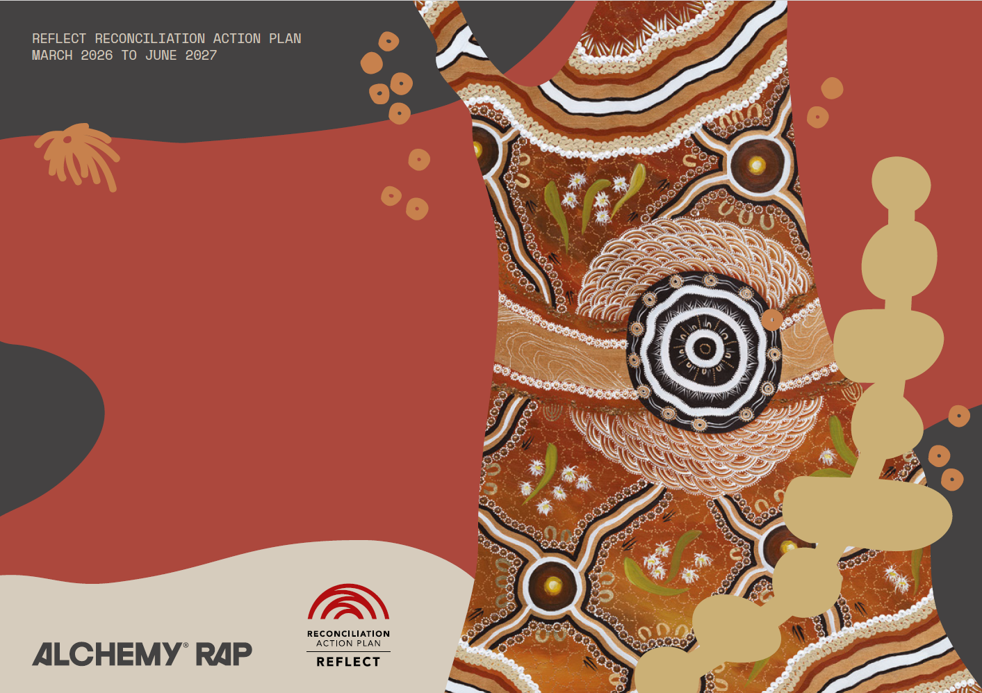
At the heart of our RAP is Jeltchering Murrup – Fighting Spirit, a commissioned artwork by proud Wurundjeri Woi-wurrung, Yorta Yorta and Wiradjuri artist Simone Thomson. The artwork tells a powerful story of Country, connection and reconciliation, and became the inspiration for a broader visual identity that would help bring our RAP to life across our business.
To help shape this next chapter, we returned to a long-time creative partner – Tim Sutherland from Studio Brave, the designer behind Alchemy’s brand identity established in 2021.
In this Q&A, Tim reflects on the responsibility of designing alongside First Nations artwork, what he learned through the collaboration with Simone, and why respectful design matters when creating a visual identity grounded in culture and reconciliation.
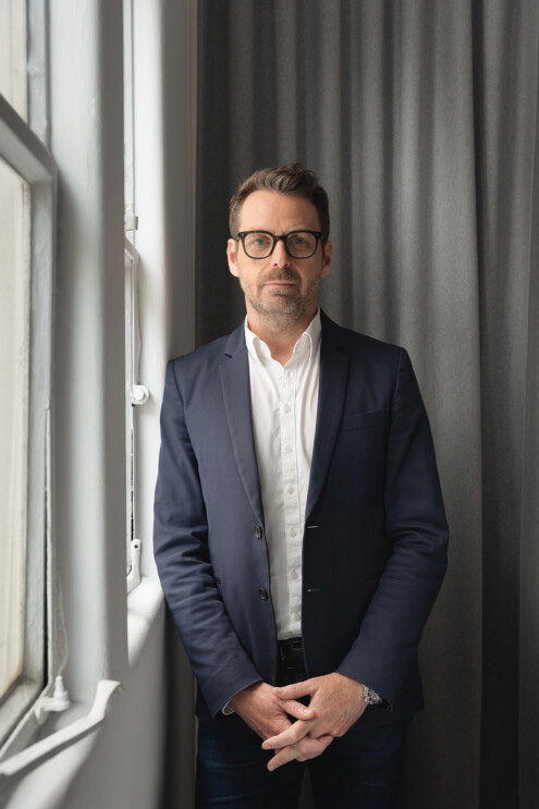
Tim Sutherland, Studio Brave
Returning to an Evolving Brand
You originally developed Alchemy’s brand identity in 2021/22. What did it mean to return and help shape the visual identity for such an important milestone in the business?
“We have remained a core creative partner with Alchemy since the initial brand inception. This is the perfect relationship a design studio can have. Businesses evolve and are always changing, so brands must evolve with them to stay relevant. We were honoured to be able to help Alchemy create this important campaign for them.”
A Different Kind of Design Brief
When you first learned the project would involve working alongside Simone Thomson and translating her artwork into a broader RAP visual identity, what were your initial thoughts?
“This was our first First Nations reconciliation project, and one I was personally really excited to be part of due to its cultural significance. Reflecting an artist’s work is a huge responsibility. You need to get it right and ensure it is done respectfully and truthfully.”
Unlike a typical branding brief, this project carried a deeper responsibility. It wasn’t about creating something new from scratch, but rather finding a way to honour and extend an existing story rooted in Country, culture and connection.
Learning Through Collaboration
Can you talk us through the process of working with Simone? What did those conversations look like?
“Alchemy managed the direct relationship with Simone and briefed me accordingly. There was so much detail to extract from the brief, so I understood clearly what her core themes were in the conception of the artwork. Simone provided feedback on our concepts, and it was clear and easy to address. With any design process, communication is key.”
How did Simone’s storytelling and cultural knowledge influence the creative direction?
“Simone’s story about the artwork was very detailed and incredibly thoughtful. There was so much to draw from within the narrative. I took inspiration from both parts of the stories and the symbolic forms and imagery from within the piece.”
As Tim immersed himself in the meaning behind Jeltchering Murrup – Fighting Spirit, the artwork became more than a visual reference – it became a guide, shaping the language, forms and feeling of the broader identity.
The Responsibility of Respectful Design
Designers are often asked to interpret and communicate stories visually. What responsibility did you feel when working with artwork connected to Country, culture and reconciliation?
“The biggest challenge I faced was getting the balance right in how I interpreted the artwork. I took inspiration from the colours, forms, shapes and patterns, but I worked hard to avoid simply replicating it. I didn’t feel that would be authentic or respectful to the artist. I had to take that inspiration and create something unique and individual, but connected directly to the source and the artist’s intention.”
How did you maintain the integrity of Simone’s artwork while creating a flexible visual identity system?
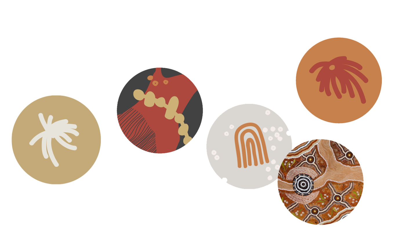
“To ensure I protected the authenticity and integrity of Simone’s work, I created a visual language to reflect her artwork, but one that lived separately from it, with its own aesthetic flair. We created a suite of illustrative shapes, forms and icons versatile enough to be used across the campaign on the various items of scope.”
The result is a visual identity that feels deeply connected to the artwork while standing confidently on its own – a system designed to grow with our reconciliation journey.
Lessons That Will Last
What’s the most valuable thing you learned from Simone during this collaboration?
“The art of caring so deeply about the work you produce. Projects of such spiritual grounding are wonderful to be involved in.”
Has this experience influenced how you’ll approach culturally informed projects in the future?
“Being my first project in this space, it has educated me on how meaningful partnerships with First Nations people work. I would love to build more relationships like this in the future.”
For Tim, the project became an opportunity for learning, reflection and a deeper appreciation of what can be achieved through genuine collaboration.
Looking Back on the Work
When you look at the RAP brand assets now, what are you most proud of?
“How comprehensive all the assets work as a set, how flexible and versatile they are, and how the campaign complemented Simone’s work while establishing its own unique personality.”
What do you hope people understand about the artwork and visual identity when they see it?
“I hope they see it as I did. I hope they can see the connection to the piece, but also enjoy it in its own right.”
A Message for Other Designers and Businesses
If there’s one thing you’d like other designers or businesses to take away from this process, what would it be?
“I think that everything we should be working towards is closing the gap between Indigenous and non-Indigenous Australians, that we can broaden our respect for First Nations culture. And importantly, as we did successfully on this project, our two cultures can work together in harmony as one.”
At Alchemy, we believe reconciliation is strengthened through relationships, learning and genuine collaboration. The creation of our RAP visual identity has been an important reminder that great design can do more than communicate a message – it can help tell stories, foster understanding and create meaningful connections.
We are incredibly grateful to both Simone Thomson and Tim from Studio Brave for their care, creativity and partnership in bringing this chapter of our reconciliation journey to life.